 Good morning everyone!
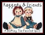
I thought I'd have a bit of a surprise for everyone by changing the look of my blog in celebration of my 500th post (which was yesterday). I really had this wonderful idea of a prim Annie but now I'm considering a actual illustration of Ann. What does everyone think?
Should I have the gingham or polka dots or rick-rack? My husband thinks the gingham is a bit much and overwhelms everything. I really love the Ann and Andy theme and I want my readers opinion.
I'm thinking I should post a series of images and have a vote? Either way my look is under construction. C&G Design






6 comments:
I think it looks fine and matches well.
I say a resounding Ann and Andy!!!!
I love the gingham..look..and I also love Ann and Andy. Which ever you decide, it will be beautiful..
I am just loving the new look for your blog! It is so fresh and so appropriate. I love to vote, bring it on! We may get some snow tonight......hugs, Kathleen
Give us some of the samples to vote on. It will be fun! I love the Header...
I like the gingham. You could lighten it a bit if you think it stands out too much. What a wonderful theme.
On boys and homework...it is a battle I would never ever undertake again. If we had had a second child, I would say "whatever"! (not to dangerous or illegal stuff) The homework is now being done in college because to do a senior thesis you have to have a 3.0 which includes math and science for a writer with no interest in either or the homework for them.
Post a Comment